
10 Reasons Your Government Website Design Isn’t Engaging Residents (And How to Fix It)
- Frankie DiCarlantonio
- Mar 1
- 5 min read
Imagine a resident in a small Ohio town sitting down at 8:00 PM to find out when the next leaf pickup is scheduled. They navigate to the village website, only to find a cluttered mess of PDFs from 2014, broken links, and a layout that looks like it was designed during the era of dial-up internet.
Frustrated, they give up and call the administrative office the next morning, adding to your staff's workload and leaving the resident with a poor impression of local leadership.
The digital front door is often the only door residents ever use.
If your government website isn’t easy to use, it isn’t just an "IT problem": it is a communication failure. At 614 Associates, we believe in straight talk. The truth is that many government entities, from small townships to larger state agencies, are failing to meet the basic digital expectations of their constituents.
Here are 10 reasons why your government website design isn’t engaging residents and, more importantly, how you can fix it.
1. Poor Content Quality and Weak Visual Appeal
Most government websites are viewed as "utilitarian," but that shouldn't be an excuse for being boring. Research shows that many public sector sites score as low as 3.4 out of 5 for visual attractiveness.
If your site looks outdated, residents will subconsciously trust the information less. High-quality graphics and authentic photography are essential to making your content approachable.
The Fix: Swap out generic stock photos for high-resolution images of your local community, parks, and staff. Use a clean, modern color palette that reflects your brand and ensures that the most important information is visually prioritized.
2. Jargon Overload and Lack of Plain Language
Only about 9% of government websites consistently use "plain language." When you use dense legal terminology or "bureaucratese," you create a barrier for the average citizen who just wants to know how to renew a permit.
Communication is about being understood, not about sounding important.
The Fix: Adopt a "plain language" policy. Use the active voice, pronouns like "you" and "we," and simple verb forms. If a fifth-grader can’t understand the instructions on your homepage, it’s time to rewrite them.
3. Outdated Visual Design
Digital trends move fast. What looked professional in 2019 looks ancient in 2026. Currently, only about 31% of government websites use modern design practices.
An outdated site suggests an outdated administration. Residents expect their local government to be as tech-savvy as the private companies they interact with every day.
The Fix: Invest in a custom, contemporary design that focuses on white space, readable typography, and intuitive layouts. This isn't just about aesthetics; it’s about professional credibility. You can learn more about how design impacts perception by reading about what a strong about page says about your business.
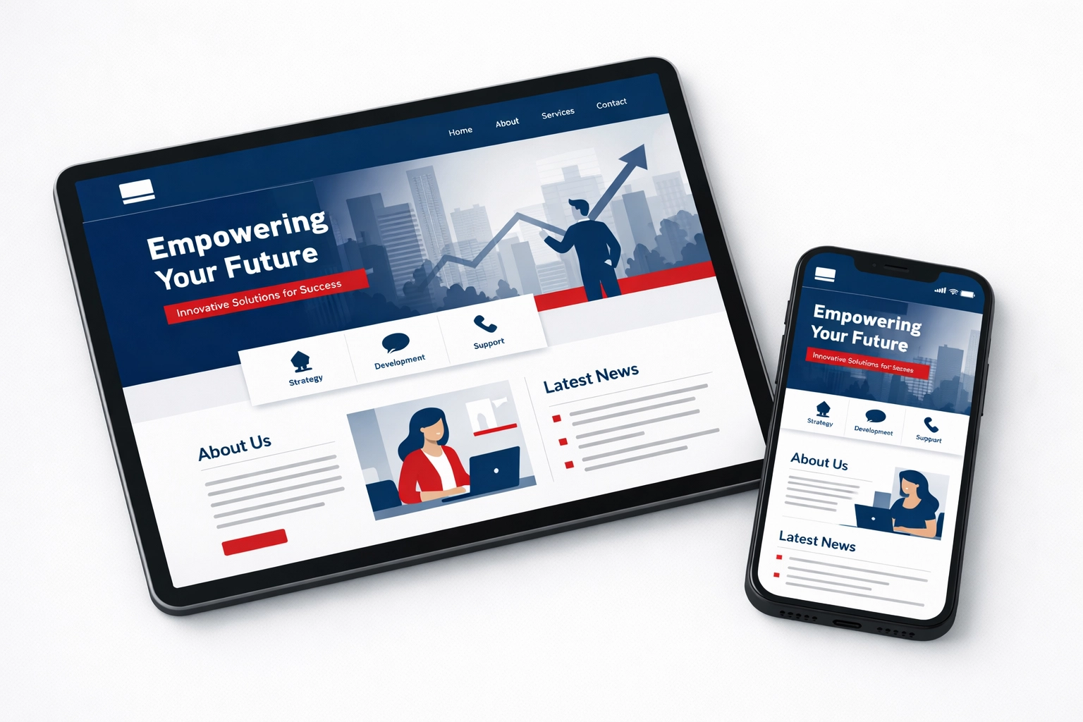
4. Non-Responsive Mobile Experience
More than half of your residents are likely accessing your website from a smartphone. If they have to "pinch and zoom" just to read a meeting agenda, you have already lost them.
A site that doesn't work on mobile isn't just annoying: it’s a major accessibility hurdle.
The Fix: Ensure your site features full mobile responsiveness. This means the layout should automatically adjust to fit any screen size, from a desktop monitor to a budget smartphone. For more on this, check out our guide on the importance of mobile-friendly websites.
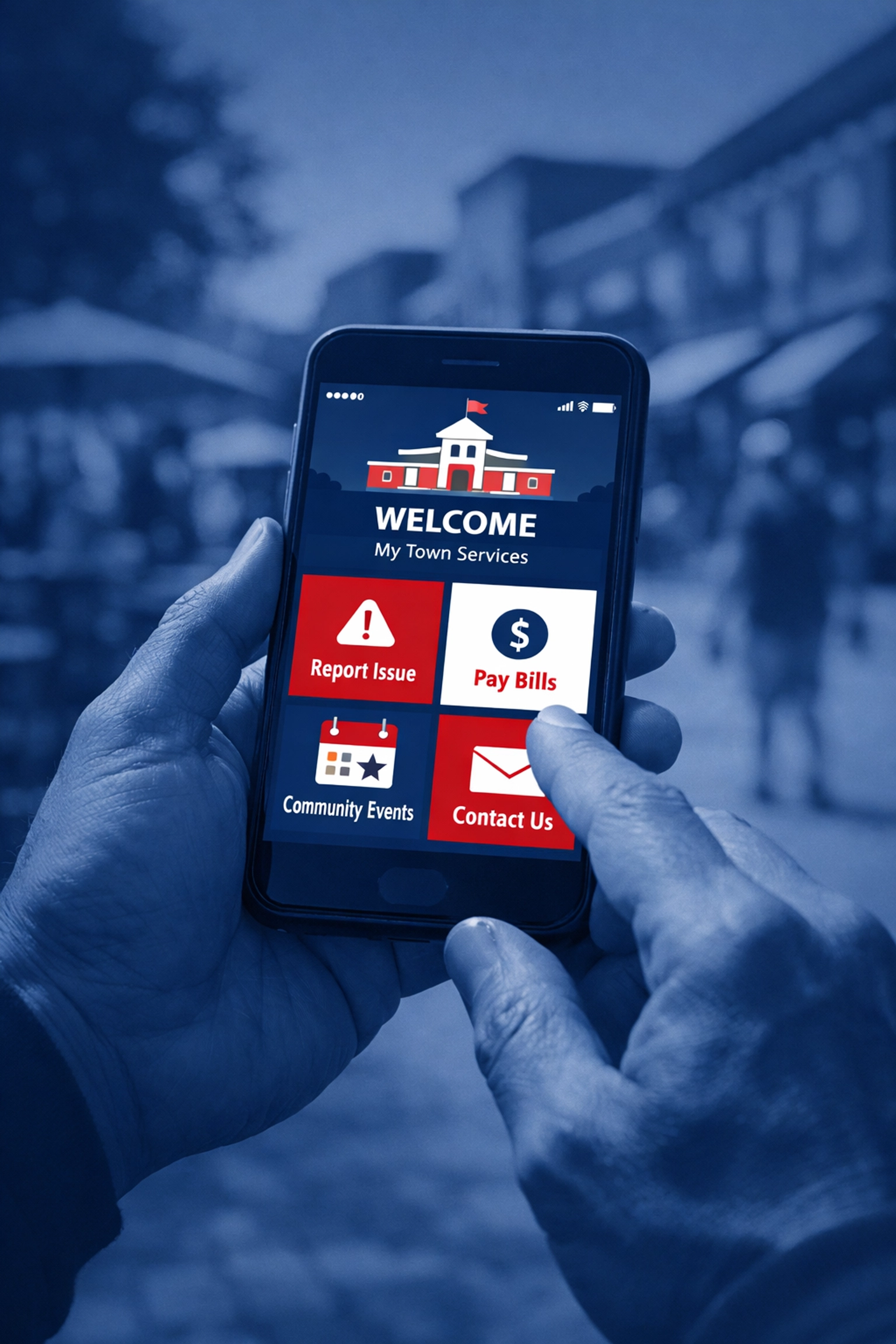
5. Confusing Navigation and "Information Labyrinths"
If a resident has to click more than three times to find what they are looking for, they will likely give up. Poor navigation architecture is one of the leading causes of high "bounce rates" on government sites.
Often, websites are organized by internal department structures rather than by user needs. Residents don't care which department handles "Right of Way Permits"; they just want to find the permit.
The Fix: Conduct a navigation audit. Look at your website analytics to see which pages are visited most and put those front and center. Use clear, action-oriented menu labels like "Pay a Bill" or "Report a Problem."
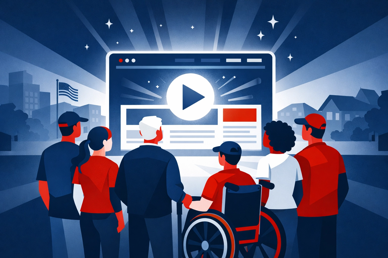
6. Inadequate Accessibility (WCAG Compliance)
Government websites have a legal and ethical obligation to be accessible to everyone, including residents with visual, auditory, or cognitive impairments.
If your site isn't compatible with screen readers or lacks high-contrast options, you are effectively locking out a portion of your community.
The Fix: Follow the Web Content Accessibility Guidelines (WCAG). This includes adding "alt-text" to images, ensuring your site is navigable via keyboard, and providing transcripts for any video content. Accessibility should be a core principle, not an afterthought.
7. Lack of Authenticity and Trust
Trust in government is at an all-time low. If your website feels like a "black box" where information goes in but nothing comes out, residents will be skeptical.
A professional, transparent website projects authority and reliability. It shows that you are open for business and accountable to the taxpayers.
The Fix: Be human. Include a directory with photos and direct contact information for department heads. Show the faces of the people serving the community. This builds a bridge between the "institution" and the "individual."
8. Missing Transparency and Accountability
Residents want to see where their tax dollars are going. If your financial statements, meeting minutes, and policy updates are buried in obscure folders, you aren't being transparent.
Transparency is the foundation of civic engagement.
The Fix: Create a dedicated "Transparency Portal" or a clearly labeled "Public Records" section. Make sure these documents are searchable and up-to-date. Don't make people file a formal request for information that should be publicly available with one click.
9. Lack of a User-Focused Purpose
Many government sites act as a "junk drawer" for every document the office has ever produced. They lack a defined purpose.
Every page on your site should answer one question: "What is the user trying to accomplish here?"
The Fix: Shift from a "broadcast" mindset to a "service" mindset. Instead of just posting a 50-page PDF of the city budget, create an interactive summary that highlights the key takeaways for the average resident.
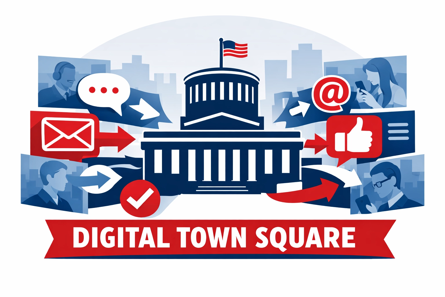
10. Limited Interaction and Feedback Opportunities
Communication should be a two-way street. If your website is just a static billboard, you aren't engaging; you're just talking.
Residents want to feel heard. They want to provide feedback on new developments, report potholes, and ask questions without waiting on hold for twenty minutes.
The Fix: Integrate multiple communication channels. Use simple feedback forms, integrate your social media feeds, and offer email newsletter signups. Creating a "digital town square" encourages public discourse and builds a stronger community.
The Long Game: Why Your Website Strategy Matters
In the public sector, your website is your most valuable employee. It works 24/7, it doesn't take vacations, and it is the primary way you interact with your constituents.
Spoiler alert: Ignoring your website's flaws won't make them go away. It will only lead to more phone calls, more confusion, and a growing disconnect with the people you serve.
At 614 Associates, we specialize in bridge-building. We provide website design and development that doesn't just look good: it works for your residents. Whether you are a local Ohio municipality or a nationwide organization, we bring the "straight talk" and technical expertise needed to modernize your digital presence.
From ensuring your site is found via strategic SEO to managing your social media presence, we help government entities become more transparent, more accessible, and more engaging.
Don't let an outdated website stand between you and your residents.
👉 Contact 614 Associates today to discuss how we can overhaul your government website and start engaging your community the right way.


Comments